Ever walked into a room and just... felt different? Like something shifted without you even realizing why? That's color working its magic on your brain.
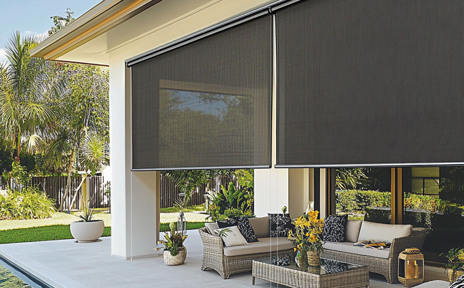
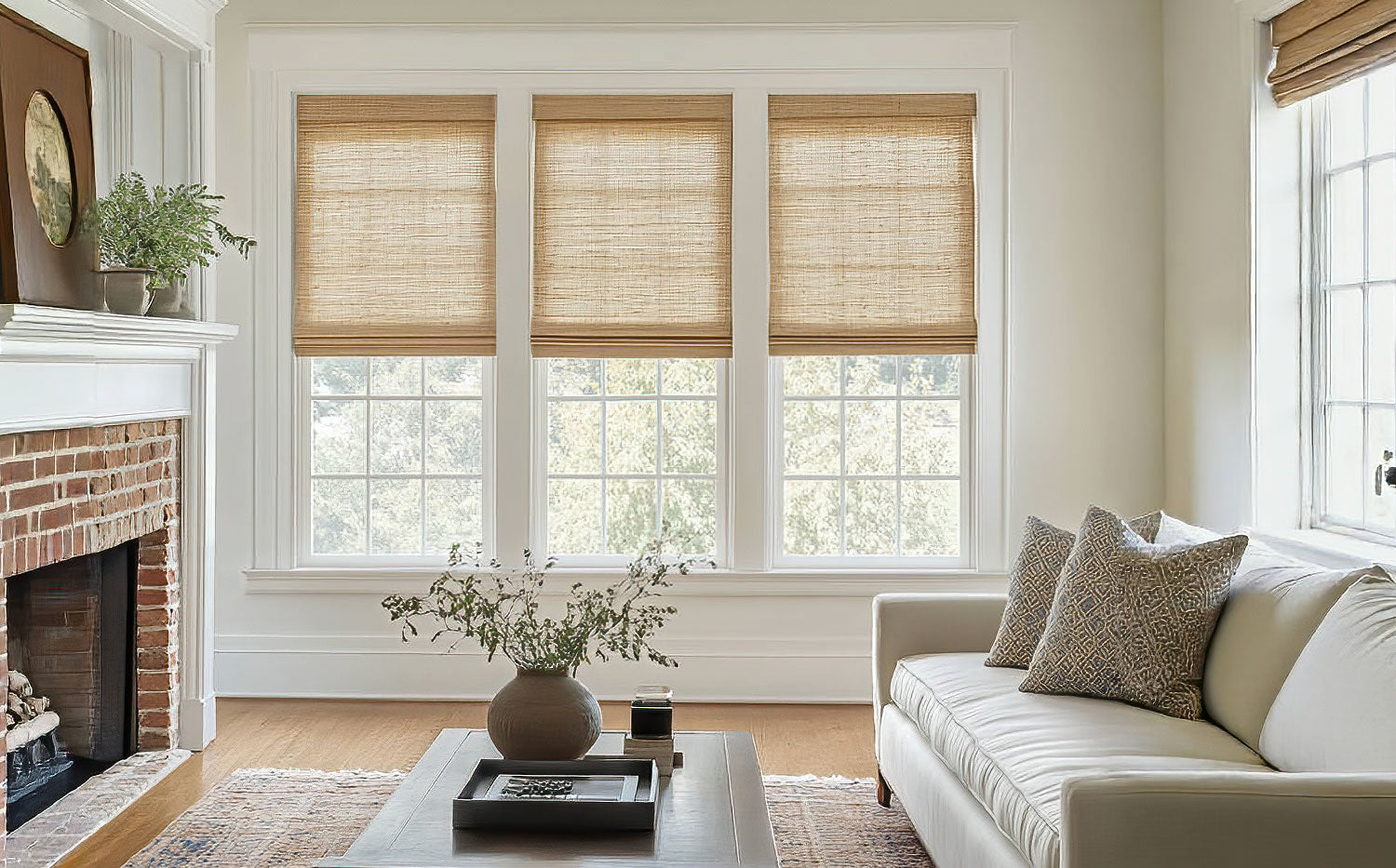
Your window treatments aren't just there to block light—they're actually shaping how you feel every single day. So let's talk about picking the right shades to boost your mood.
Why Colors Actually Mess With Your Head
Here's the thing: science backs this up completely. Your brain processes colors before you even know you're looking at them.
Blue slows down your heart rate. Red gets your energy pumping. Green? That's like hitting your personal stress-relief button.
Think about it remember the last doctor's office you visited? Those calm blues and soft greens weren't random choices. Someone knew exactly how to calm your nerves.
Your home works the same way. Every morning when sunlight comes through your blinds, those colors are basically setting your mood for the day.
Blue Blinds: Like Having a Chill Pill for Your Windows
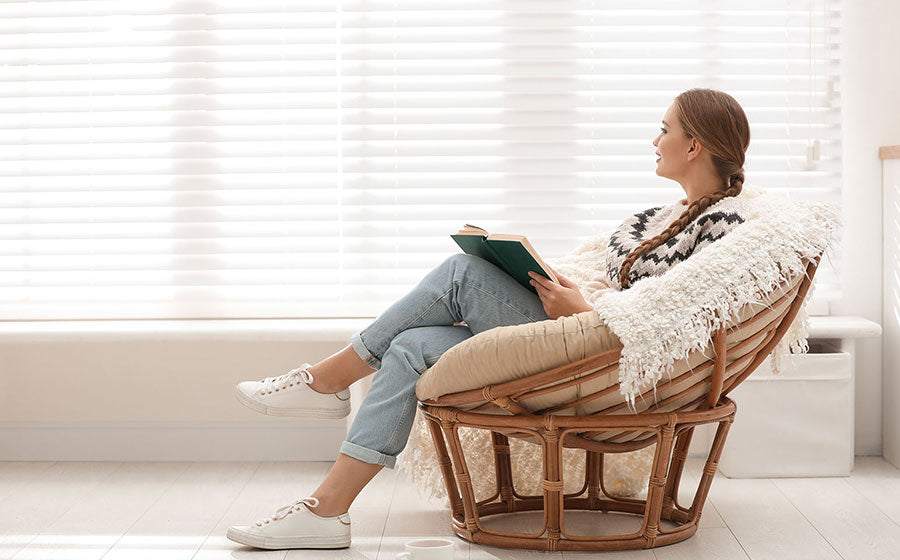
Want to turn your bedroom into the ultimate relaxation zone? Blue's your best friend here.
This color actually tricks your brain into thinking it's evening time. Your body starts making melatonin earlier, so you wind down faster and sleep better.
But here's what's tricky—not all blues work the same way. Navy can make small rooms feel cramped. Powder blue might remind you too much of a baby's nursery.
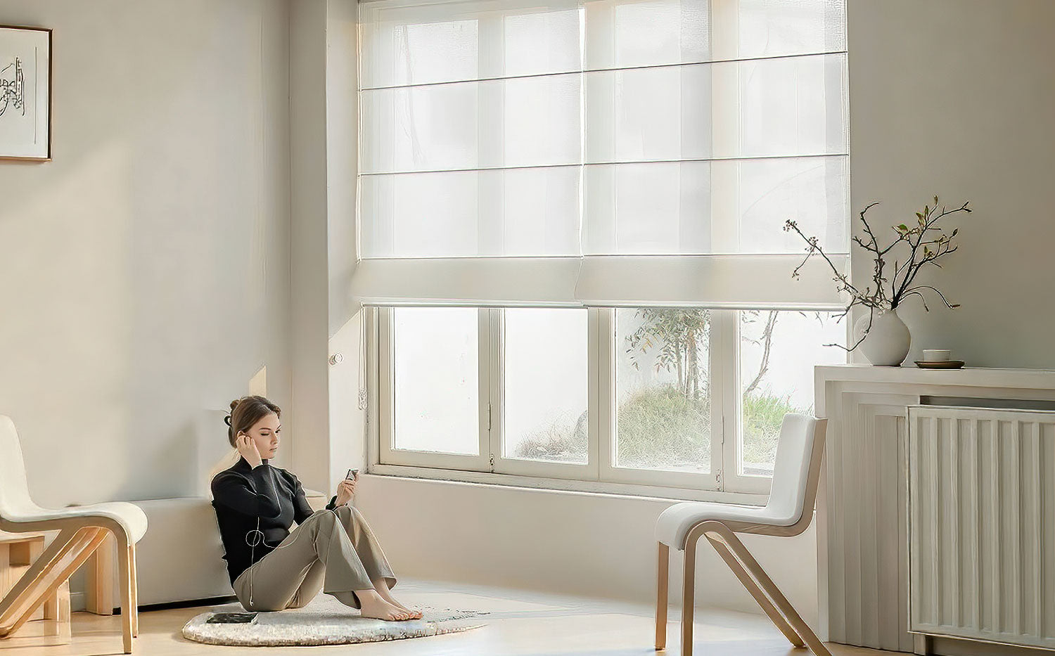
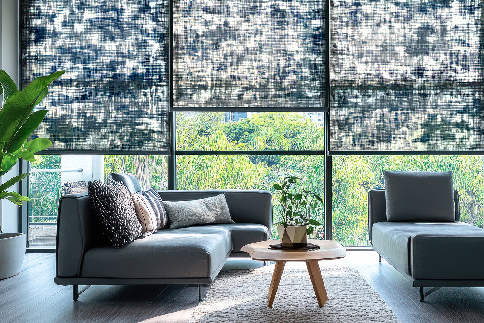
Sheer Roller Shades in soft blue are perfect because they let just enough light through while keeping that calming vibe. Great for bedrooms where you want peace but don't want it pitch-black during the day.
Green: It's Like Nature's Reset Button
Feeling scattered lately? Can't focus during those video calls? Green blinds might actually save your sanity.
Your eyes literally relax when they see green—it's the easiest color for your vision to handle. Less eye strain means your brain doesn't get as tired.
Studies show office workers with green views feel more creative. Students do better on tests in rooms with green touches. Why not give your home office this same advantage?
Forest green works great in traditional spaces. Sage green fits right into modern homes. Even that trendy olive shade can work if you're feeling adventurous.
Red and Orange: Energy Boosters That Can Totally Backfire
These colors wake up your nervous system fast. Heart rate goes up, blood pressure rises, energy spikes.
Sounds perfect for a kitchen or home gym, right? Well, maybe. But you've got to be careful here.
Too much red can actually make people cranky. Ever notice how arguments seem to happen more in red rooms? That's not just coincidence.
Orange feels way friendlier than red but still gives you that energy boost. Think sunset vibes instead of fire-truck intensity.
Your best bet? Use these as accent colors rather than the main show. A burnt orange valance over neutral blinds gives you the energy without making your space feel overwhelming.
Yellow: Could Be Sunshine or Straight-Up Headache Material
Yellow should make you happy, and sometimes it totally does. But sometimes it makes you want to run away screaming.
Soft, buttery yellows can brighten up dark rooms and lift your spirits. Think gentle morning sunlight, not neon highlighter.
Bright yellow? That's migraine territory for a lot of people. Your brain gets overstimulated trying to process all that intensity.
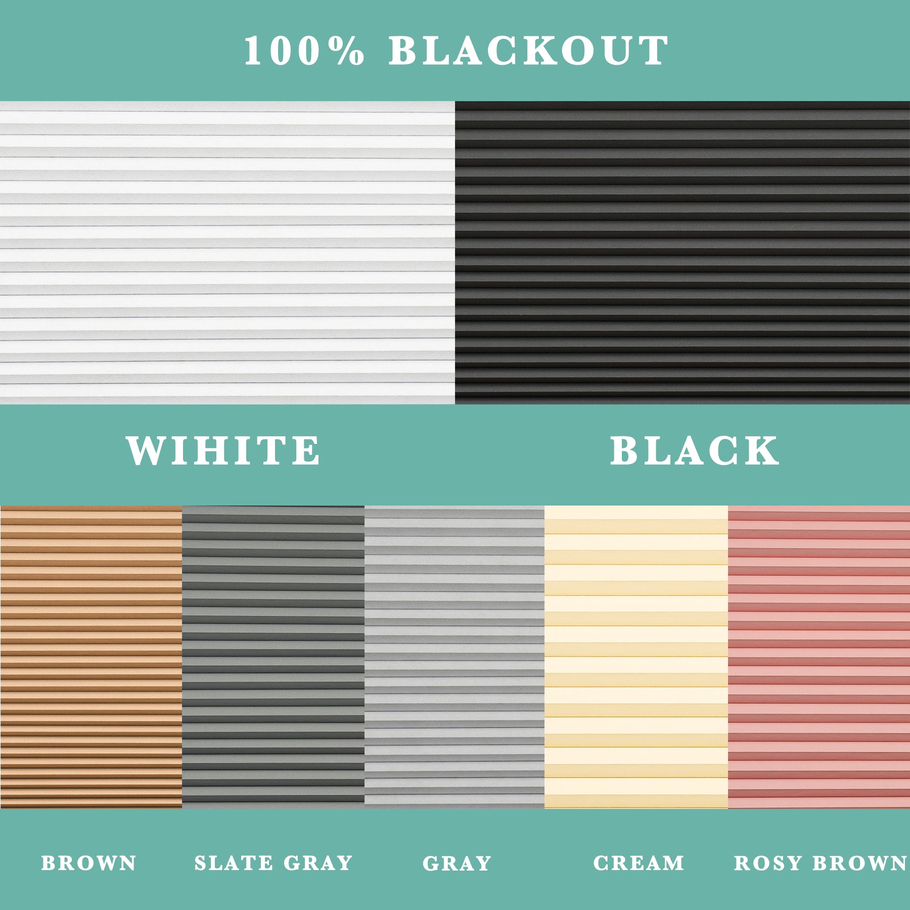
Motorized Cellular Shades in cream or champagne colors give you yellow's warmth without frying your nervous system. Plus you can adjust them throughout the day as your energy needs change—pretty cool, right?
Purple and Pink: Way More Complicated Than You'd Think
Purple makes some people feel fancy and sophisticated. Others find it depressing or just fake-looking.
Light lavender can be as calming as blue. Deep purple might feel way too dramatic for everyday living.
Pink completely divides people. Blush pink feels modern and soft. Hot pink? That's a lot of intensity to wake up to every single morning.
Do yourself a favor and test these colors first. Live with samples for at least a week before you commit to anything.
White and Neutrals: The "Safe" Choice That Isn't Always So Safe
Everyone thinks white blinds are foolproof. Not really true, though.
Pure white can feel harsh and cold. It bounces too much light around and creates glare that makes your eyes work harder all day.
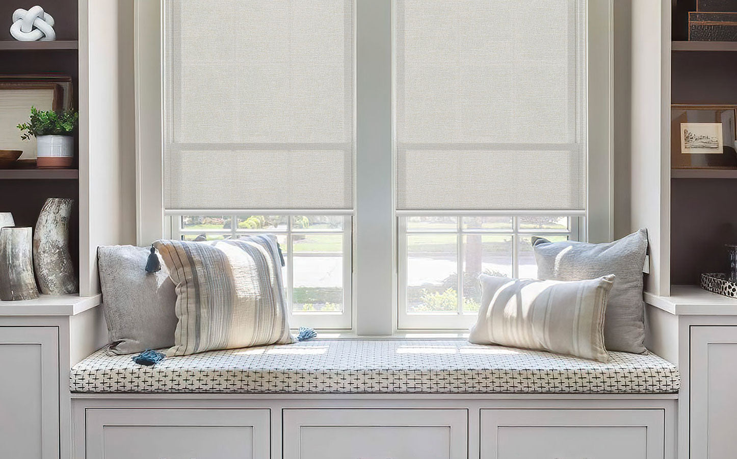
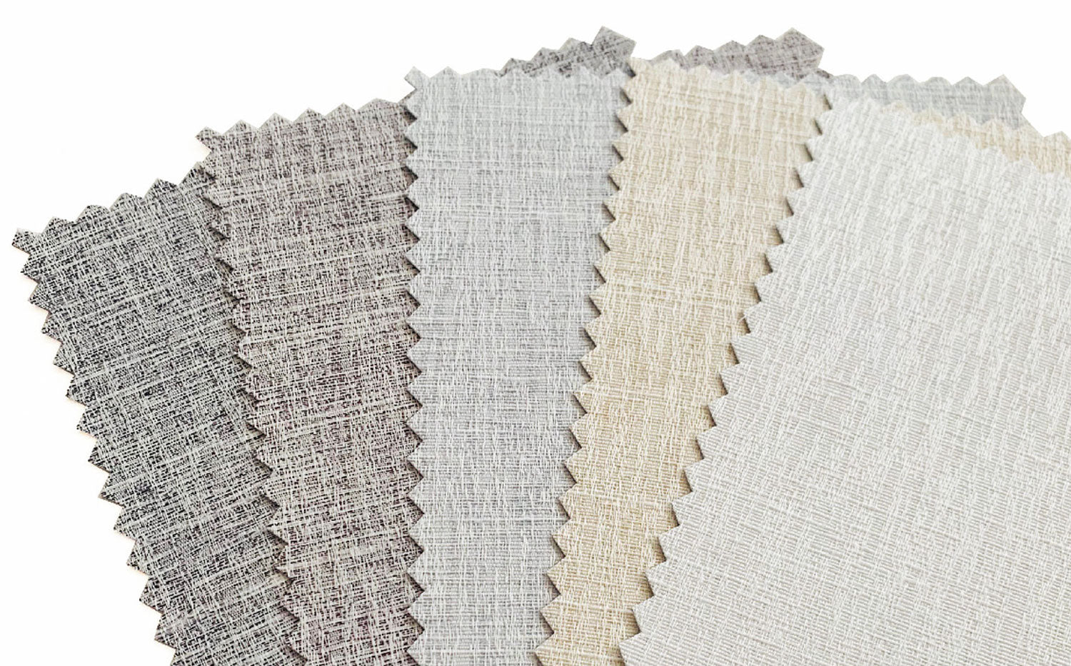
Off-white, cream, and beige feel much warmer. They soften that harsh sunlight while still keeping your rooms bright and airy.
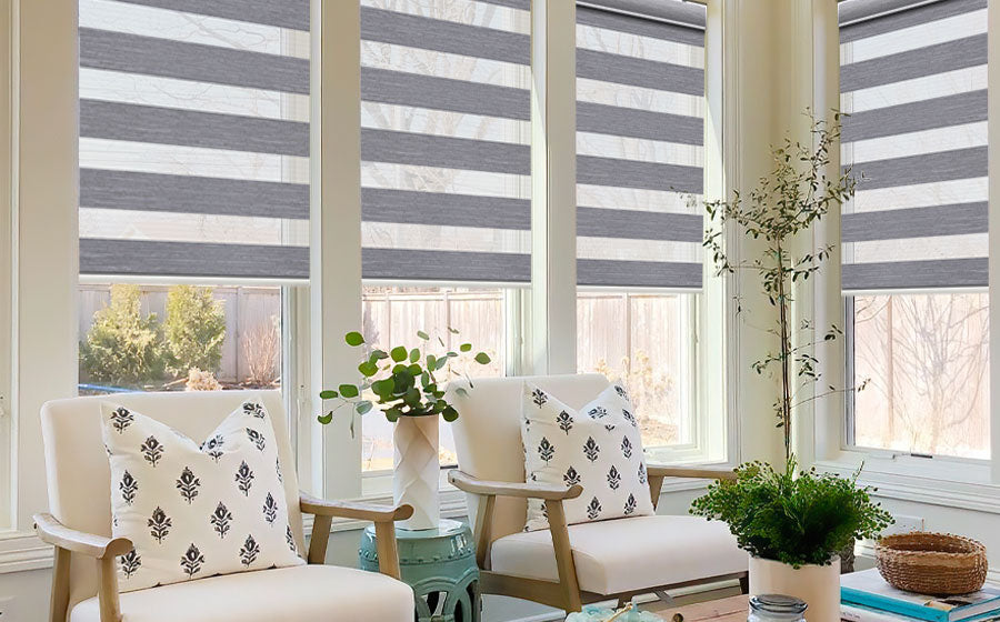
Gray's having a major moment right now, but be smart about it. Cool grays can make spaces feel lifeless and depressing. Warm grays with brown undertones work way better for daily living.
When Smart Tech Meets Color Psychology
Now here's where things get really interesting. Custom Smart Blinds let you actually change how color affects you throughout the entire day.
Morning person? Program your blinds to let in energizing light right when you wake up. Need laser focus for work? Adjust them to create the perfect concentration zone.
Evening wind-down becomes totally automatic. No more forgetting to close your blinds and lying awake with streetlights streaming through.
Different family members need different vibes, and smart blinds can adapt to whoever's using the room. Pretty neat solution.
Your Room-by-Room Game Plan
Your kitchen needs completely different energy than your bedroom does. Don't just use the same color approach everywhere.
Bedrooms work best with blues, soft greens, and warm neutrals. Living rooms love earth tones, sage green, and cream colors. Home offices need green for focus and soft blue for clear thinking. Dining rooms should have warm colors that make your food look amazing.
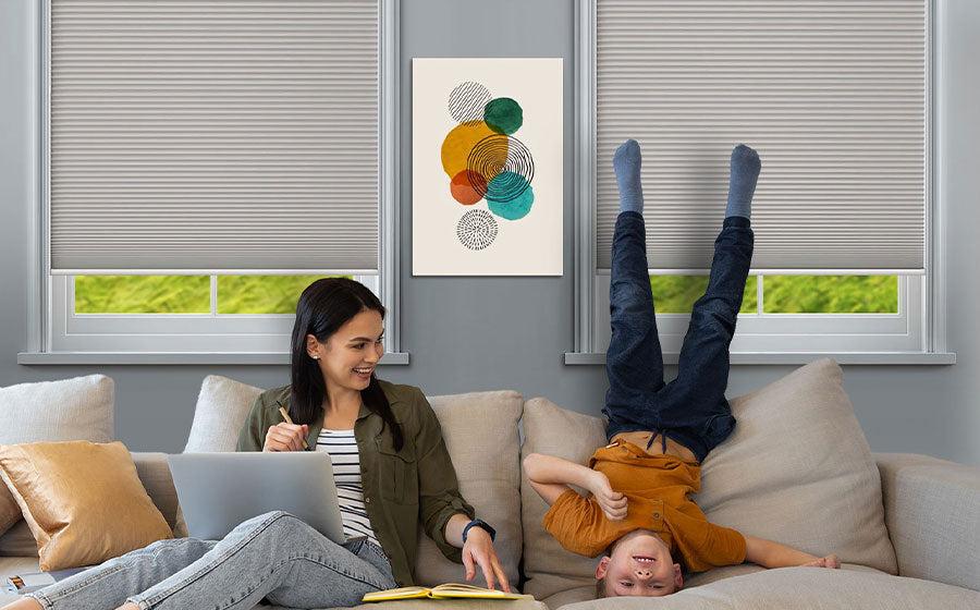
Kids' rooms are super tricky because they need stimulation for playtime but calm vibes for sleep. Consider blinds that can actually shift color temperature as the day goes on.
Bottom Line
Colors aren't just pretty decoration they're like mood medicine you can control every day. Your blinds are setting the emotional tone whether you realize it or not.
Pick colors that support how you actually want to feel, not just what looks good in Instagram photos. Your brain's going to thank you for finally paying attention to what it really needs.

